
This might be a topic that I’ve written about a few times before, but it’s still one of the things I get asked about most. When small business owners are looking to get exposure on wedding blogs, they always want to know how to maximise their chances of a successful campaign. So, today I’ve pulled together seven new little tricks that I’ve seen work for many of my advertisers recently. Enjoy!
1. Show your products, not your customers
Your advert needs to be eye catching, but more than that, it needs to be crystal clear what it is that you’re offering. Look at some of the current adverts on my site. If there was no text on them, would you still be able to tell what each advertiser was offering?
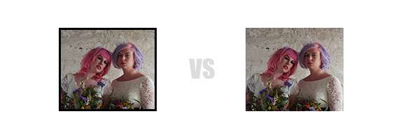
Typically, a photographer might show a bride or a couple, but does that convey ‘photographer’ to the viewer? Or do they see the dress and think “Oh I wonder where she got that?” or see the cool car they’re standing next to and think “I wonder where I can hire one like that?”. Don’t advertise your customers, instead showcase your tools or products. For example, if you’re a photographer you might show a camera, a make up artist might show someone applying make up, a transport company might show a double decker red bus. This is easier if you offer a product (such a shoes, dresses, rings or stationery) rather than a service (photography, videography, wedding planning).
I saw an advert for a wedding photographer recently that was a beautiful image but it was a close up of a bride applying mascara. To a casual observer this looks like an ad for a make up artist. Think of it this way, if Virgin Atlantic were advertising their brand new planes would they have an image of people enjoying a holiday or one of the actual plane?
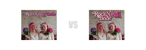
Yes it feels a little cheesy, especially for photographers to have a photo of themselves with a camera, and I wasn’t actually convinced of this until Gareth proved it to me with some cold hard stats! We reached out to one of our advertising partners, Lisa Devlin, and worked with her to create a completely new graphic putting into action many of the topics covered in this post. And here’s the result:

The original advert had already been running on the site for several weeks and so we had historic statistical data on how it was performing. So, after coming up with the new design all that remained was to let it run and collect the new data. The updated advert has been running for three weeks and as you can see, the results proved positive.
The ‘Clicks in this category’ statistic shows what percentage of visitors specifically clicked on our target advert compared to all clicks on adverts of this size. Bigger is better in this case, and it demonstrates the new graphic has a greater likelihood of being noticed and clicked by visitors.
‘Average rank’ pitches all adverts of this size together, in order of performance (or click-percentage, if you like) throughout the test period, and is a great indicator of how the target advert is performing in comparison to all the others. Lower is better. With a 5.8 out of 15 before, this original graphic was already safely in the upper half, but even so the updated artwork pushes it up just a couple of places shy of the top spot!
2. Use every pixel
You’re paying for them after all! You might think putting a thin border around your ad will make it stand out from the crowd. However an unwanted side-effect is that it makes the advert feel enclosed and cramped. You do not want your advert to feel claustrophobic.
3. Don’t cut the advert into sections
Either with solid colours or more than one image. It gives the appearance of two (or more) smaller adverts rather than one large. Smaller adverts are obviously harder to grab the viewers attention with. If you’ve paid for a large advert, treat it as such.

4. Your name needs to be clearly legible
It sounds stupidly obvious but if your logo or name is hard to read, people won’t strain their eyes trying. If you have a really detailed logo or intricate font don’t use it for the advert. Your expensive branding can start working for you once you’ve got the visitor to your website, where you have lots more screen-space to play with. In the confines of a banner advert you need to make sure the viewer can read your name easily. Communication should win out over style.
5. Keep it simple (stupid)
The majority of the adverts on my site are 140×120 pixels, which isn’t a lot of space. So you really only want two or three ‘things’ in the image at most. Otherwise it’ll be hard for the viewer to make out what they’re looking at. If you’re advertising wedding stationery for example, don’t put use a photo of a wedding invite on a fully laid table, with charger plates, all the cutlery, glass-ware and flowers around it. It might be a stunning image but when shrunk down so small it’s way too distracting.

When a visitor’s eyes pass over your advert (and let’s be honest, they are passing OVER – nobody goes looking for adverts!) you need to be making it stupidly clear what you’re offering.
6. Ask for feedback
Try printing your advert out at actual size and showing it to friends and family (or strangers, if you’re feeling brave and want the best feedback). Show them the advert by revealing it and hiding it again just a second later. If they can’t turn to you and say what product or service your advert is offering then it’s unlikely to succeed online either.
7. Be creative with the shape
This is somewhat contradictory with tip #2 but hear me out! All the adverts are square (well, rectangular if you want to be pedantic), but by matching the background colour of your ad to the colour of the website where it’s going to be presented, you can create the illusion of a circular, triangular, or anything-you-like shaped advert. One of our most successful (in terms of clicks) at the moment is cunningly shaped like a sheep and is out-performing every other advert in it’s category (and even some of better located more expensive ones) because it stands out.
Having a successful advertising campaign isn’t just a case of designing something quickly and whacking it up on any blog that will take you. It takes thought, consideration, and much trial and error to get it right. I hope these tips will go some way towards helping you to book the clients that you really deserve.
Suppliers
- Photography: Shell De Mar Photography