Confession: I’ve been trying to write this article for a while, in fact ever since we launched The Green Room at the beginning of the month. However I keep putting it off because it’s a difficult subject for me to actually to get my head around, and an even more taxing matter to try and explain my jumbled up thought process to you…In fact I’m 99% sure I will come across as a bit of a douche – hence the article-writing-hesitation.
I basically want to talk a little bit about web design, and specifically about making your website design different, but more than that – a challenge to the people visiting it and why I think this is a positive thing. This is probably a subject that, on first inspection, the majority of you will decide that I’m clearly mental, and be of the opinion that it’s best to make our websites as clear and easy for visitors (and potential clients) to navigate as possible. Well maybe yes, however let me explain why I’m teetering on the other side of the fence right now…
Image Credit: Braid Creative
When we came up with the The Green Room concept, specifically the sliiiide function, I was initially dubious. I’d never seen another blog using a horizontal navigation within a relatively standard blog format and I was worried that people wouldn’t ‘get it’.
Within the first week or so of the launch I was being asked the same questions over and over by people struggling to figure out the functionality of the sliding tab. Whilst I could have easily got annoyed and/or spent 23 hours a day explaining and re-explaining how to make the damn thing slide to everyone that asked, for the most part, I decided to let people figure it out for themselves.
Weirdly I was actually kind of pleased that some people couldn’t work the slide function out. It sounds very unorthodox, but I liked the fact that entering The Green Room was a challenge to some people and it really didn’t bother me if some people gave up and couldn’t get it. Why? Well first of all, it was an experiment. We didn’t know if people would even like the concept of a wedding blog simultaneously blogging about business stuff, and if it did fail, I was actually OK with it (I’d just go back to having much less writing to do!)
Also, the people that didn’t ‘get in the room’ failed a pretty simple intelligence test (and one that only really required people to take a little time and have a play around if they couldn’t figure it out right away) and in many ways I think the people who couldn’t be bothered to make that little effort don’t deserve all the amazing free business advice that’s hidden within this secret room of ours!
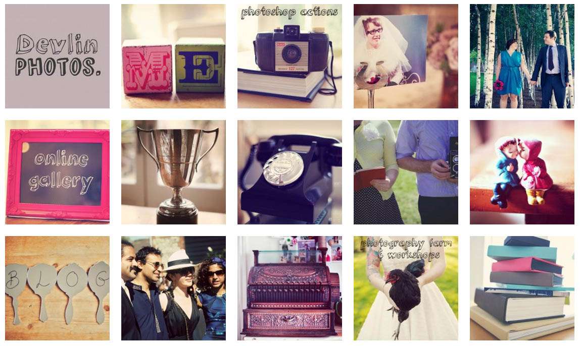
I spoke to a number of my industry friends about this matter, in particular wedding photographer Lisa Devlin who went through a similar thing when she re-branded her website two years ago. She purposely wanted to make the design different to all the other wedding photographers out there, not only to make her stand out from her competitors and make her website memorable to brides who will potentially looking at a whole bunch of wedding photographers at the same time, but also in order to set up a bit of a filter. She explains,
“Two years ago, I decided to overhaul my business including re-branding to a look that I felt reflected both me and my work. I also set out to change the website. I’ve have had a website for my wedding photography business since 2000 and apart from some tweaks along the way and a colour change, it had remained in its original format since then. By 2008 it was doing nothing to help me stand out from the crowd.”
“After meeting with some web developers who said my initial ideas wouldn’t be possible, I found Michael at This is Deliberate whose portfolio was really creative. My big idea was that when you arrived at the site, it was a collection of squares with no visible text apart from the logo. My previous site had a fair amount of text but from the questions I was getting, it was obvious it wasn’t getting read much. I wanted the images to do the talking but was told that you needed an obvious navigation bar. However Michael ran with the idea that it could be done away with. I also wanted the blog to be an integral part of the site. The blog is the bit which gets updated the most and I’m not sure if going forward people will have static sites now that blogging has progressed so much. It was obvious after looking at some existing templates, that my site was going to have to be built from scratch but as I was after something innovative, this was a cost I was prepared to pay. Sadly there is so much blatant copying that goes on in our industry that I thought it would be no bad thing to create a site that would be difficult to emulate and obvious if someone had done so.”
“Just before I launched the site, I did have a last minute panic that it was going to be too out there. What appears to be a random collection of images, start to make sense when you scroll over them and the text pops up. The static pages that are the website remain in fixed positions so the image of an old phone is my contact details, the cash register is the pricing etc. Some of the squares are blog posts, so there is a permanent one for weddings, another for engagements etc. These squares have different images every time you refresh the page as will the remaining squares that are made up of rotating random blog posts. You never hit the home page to the same set of images so it remains fresh. In essence it is a simple idea but it might take a while for a brand new visitor to ‘get it’. However this was really what I wanted – for people to actually engage with the site and see it as something unique. It’s not to everyone’s taste but enough people seem to enjoy getting lost in the site and the images so it’s been a big success for me.”
“New visitors and potential clients do have to do a little bit of work to find their way around and to work out how to get a quote. However frankly if they can’t be bothered to locate the pricing form and fill out their details then I can’t be bothered to shoot their wedding! It sounds harsh but I do get at least 50 enquiries a week and obviously I can’t shoot that many weddings so I see it as the first filter to make sure I’m getting the kind of clients that I will connect with. The kind of couples that I really love to work with will usually not only fill out the form but also put a lot of details about their wedding in the comment box – if they make the effort, I want to make the effort!”
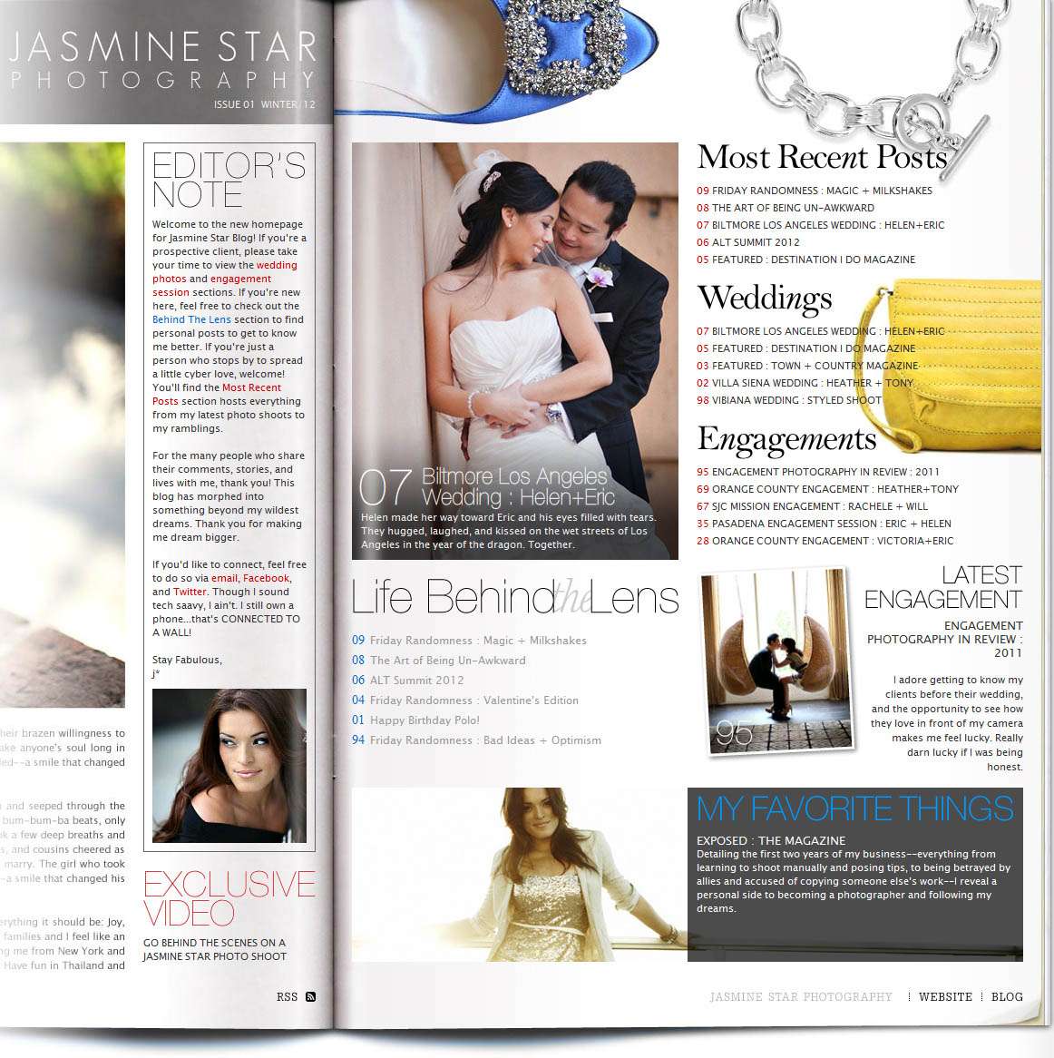
Another wedding photographer who’s website certainly stands out from the crowd is that of Jasmine Star. Not only is her branding impecaible and a perfect representaion of her business, but her blog navigation has been designed to be intregral to that branding – like a glossy fashion magazine. However it wasn’t always like that, and when she first launched it it wasn’t 100% smooth sailing either, as she explained to me over email,
“Something happened for my business in 2009: It exploded. Now, please forgive me if this comes off as arrogant…that’s so far from the sentiment, truly. It’s just that it felt like someone slipped a grenade into my business and the remnants of what was once organized, neat, and tidy, were left plastered on nearby walls. My blog started as an online journal set to document my failed attempts at starting a photography business in Los Angeles. What resulted, however, was an online journal documenting the adventures, minor successes, and tips on what to avoid when following your dreams.”
“Once the business grew, the blog posts became multi-faceted and the audience became larger. In addition to stories of my daily life (I’m sure there were those who were tired of hearing about my dog, Polo), I began posting images from recent shoots. Over the years, the mixing of posts created an ebb and flow, but in 2009, I realized that while loyal readers knew there was a semblance of continuity, a new reader would be completely lost. Like, am I reading about Jasmine Star’s obsession with canned tomato sauce…or, wait…I’m reading about eating too much chocolate…err, no…she’s a professional wedding photographer? To be honest, it was a hot mess.”
“When I first launched my blog’s splash page (a directory of sorts where readers could easily access the main page, or just highlighted categorical work), the feedback wasn’t that great. Okay, it was awful. While people appreciated the aesthetic appeal, they felt it was too much of a departure of what they knew. They, essentially, had to view and navigate things in a new way and it bothered them.
So I did was any normal petulant girl would do: I ignored them.”
“Implicitly, I knew that over time loyal readers would discover how to read it in a way that made sense to them, but–moreso–new readers would be able to get a better sense of who I was quickly and with ease. At the end of the day, that’s where the value lies: new readers connecting with loyal readers to connect on the web.”
“If you’re at a point in your business or blog writing endeavors and you realize there’s a weakness in how people are connecting with you (and each other), then do whatever you must to address this issue. Sure, there may be those who oppose the changes, but if they’re true friends/readers, they’ll stick around and support you along the way.”
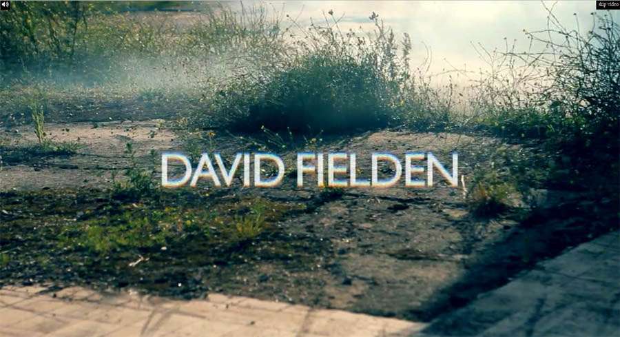
However it’s not just wedding photographers who want to use their websites to stand out from their competitors, create a strong sense of a brand and to challenge their visitors. Just last week I went to visit the incredible David Fielden in his studio, and in between swooning over the glorious dresses we got chatting about his website. What I love about David’s site is that unlike a lot of the bridal designers out there his style and branding is clear, concise and obvious as soon as you hit the site. As soon as you land on the page you’re presented with full page video. It’s gritty, it’s fashion forward and it straight away gives you a sense of what David wants to portray with his work. There’s concrete and fire for goodness sake, that’s not very ‘classic bridal’ at all is it?! People are either going to love it or hate it, but it is a genius way to immediately showcase what he and his work are all about. At the same time he will attract the very specific and fashion forward bride and repel the more conservative customer.
“My company has been in existence for 35 years and Its strength has always come from the creativity and my desire to constantly change and develop,” David told me. “My background is in theatre design and dance/choreography and I have an insatiable appetite for all the arts. This obviously comes into play not only in my design inspiration but also in the way I brand my company. The advertisement and website for my collection 2012 started with the presentation of my Milan show last June. I wanted to contrast the fragile and romantic quality of my dresses with a gritty urban quality. The idea stemmed from a video I saw by Buster Rhymes which depicted a bleak city landscape with a child on a swing. Music of all kind has always inspired my work and for my show I used Islamic music because it brought the fantasy and romance straight back into the 21st century. Although I don’t fee my website is difficult to navigate it is certainly not like other designers! I want my costumers to be inspired when they go to the site and to have an emotional engagement with the brand this I have tried to achieved by the use the sound and films.”
So what do you think? Do you agree that well designed but more complicated websites have a place within our industry? Do you think you should challenge your visitors when they first visit your homepage or do you think it’s foolish to maybe put off potential clients? Should we be using our websites to filter out potential time wasters like Lisa, to establish a strong sense of self like Jasmine or to push the industry forward like David?
Comments please!


