
Design and usability trends for websites move on so quickly these days that it can be difficult to keep up. You might spent thousands on a new custom designed and coded beauty, only for it to be out of date in a few months time! Which is why you need to make sure you understand the fundamentals of a well functioning website before you do anything else.
These are the three biggest mistakes I see people making with their websites over and over again:
1. The next step isn’t obvious
By tracking eye movements over a screen, Jakob Nielsen, the leading web expert behind the Nielsen Norman Group, discovered that the majority of people read web pages in an F-shape (two horizontal stripes followed by a vertical stripe). A similar study found that websites have as little as 2.5 seconds to grab a visitors attention before they’ll look for what they need elsewhere. You can read more about both these findings here.
![]()
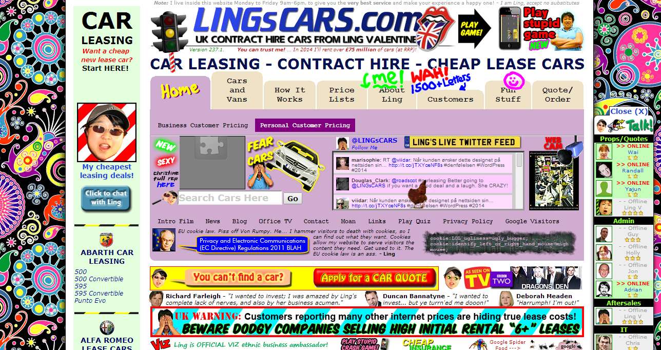
This is important to note because if your homepage layout is confusing, or too far removed from the usual format, new visitors may be disorientated. Instead of trying to figure it out they will most likely click away instead. There’s a reason why most blogs have a big header at the top, the main navigation under that and a sidebar with the most important links – because it works and people understand it.
It is vital that a new visitor knows what the next step is in order to get to where they want to be. Do they have to scroll to get to the content? Do they need to click ‘BLOG’ to get to the blog? Are the contact info, portfolio or FAQ’s easy to find? Never make your navigation links cryptic. If people don’t know what things mean, they will not click them!
Keep your overall design simple. You can add those personal flourishes with some well designed branding once you have your basic layout in place. In a nutshell, if it isn’t clear what people need to do next, they’ll just give up.
It was popular a while back for websites to get very clever, to challenge the visitor and really get them to engage with it. While this worked for some (my friend Lisa Devlin is a great example. Her site has no clear navigation at all because she wants to put some people off – she gets more enquiries than she can handle as it is!) over recent months I’ve been noticing that the trend is swinging back around to classic minimalism – white backgrounds, just a few core colours and fonts, and really obvious navigation.
2. You’re giving people too many choices
If you offer your visitors too much choice, they’ll be less likely to do what you want them to do. Imagine walking into the toothpaste aisle at your local supermarket. There are so many options that it can a) be very overwhelming and b) be tricky to remember which one you usually buy. If you’re anything like me you just end up picking the one that’s on special offer or that you recognise first. I know we end up with a different brand nearly every time!
You do not want your website to be the toothpaste aisle. You want to direct your visitors, very clearly, towards what you want them to do next. Ask yourself what that is. Do you want them to look at your portfolio? To read your sales page? To browse your blog? To subscribe to your mailing list?
I’m sure some of you are now saying, “But wait, I want people to look around my whole site!” and while that’s fine, and maybe people will, you’ll have MUCH greater control over what your visitors will do next if everything on your homepage is not competing for attention.
Less is more. Remove anything that doesn’t need to be there. Get rid of those pointless flashy graphics or ugly and unused widgets in your sidebar. By taking things away your new visitors will be much more likely to pay attention to what you really want them too.
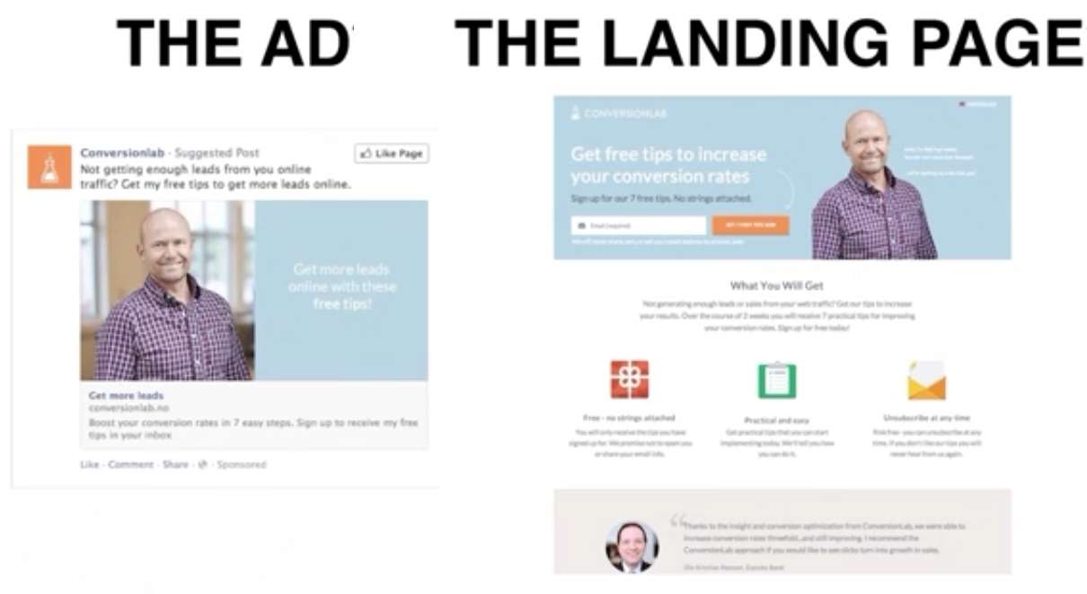
3. Your landing page doesn’t match your marketing
I recently listened to this amazing webinar from Unbounce.com. In it they discussed the three landing page mistakes that 98% of marketers were making. Although not all of it was relevant to me I listened, enthralled, all the while thinking of ways I could take what they were saying and relate it to my own business.
I’ve made this point three in this post because I know a lot of people reading this will be doing some kind of online marketing. I also bet that most of you (well, 98% according to Unbounce!) are getting it wrong.
There are three stages to a converting an advert successfully into sales (or whatever the purpose of the ad is):
1. The ad needs to grab someone’s attention.
2. When they click through, your landing page headline needs to hold their attention.
3. Finally, your design needs to focus their attention.
If you are advertising online then they suggest that you should have a landing page rather than linking the ad directly to your homepage. After hearing this I actually added this tip to my latest media kit. A lot of my advertisers have created them and have since seen an increase in visitor engagement and enquiries. The reason for having a landing page is that you can then be very specific about what you want the new visitor to do as soon as they land on your site (i.e. following points one and two above).
However, the most crucial thing is that your landing page matches the advert it’s linked from, both stylistically and with the message it’s portraying. If there is a disconnect with these things then it will only cause confusion to the people clicking through.
The landing page also needs to deliver what the advert promises. If, for example, your advert says “50% off wedding dresses!” the first thing the visitor needs to see once they click through is some large text saying “50% off wedding dresses!” so they know they’re in the right place. You can then very easily direct people to where they need to go next to redeem this special offer.
You definitely need to watch the webinar to get further explanation on this one (this section starts at around 9 minutes in) because it’s all golden information for people doing any online marketing and they definitely explain it better than I ever could!
So let’s be honest with ourselves today. Are you making any of these mistakes with your website? If so, do you plan to make any changes after reading this article?